Perel
Perel is an existing brand within the Velleman Group that focuses on practical electronic products and tools for everyday use. Despite its broad presence, the brand lacked clear positioning and appeal. Comma was tasked with strengthening Perel in a competitive market dominated by B-brands and private labels.
Challenge
Perel was positioned too broadly and was often perceived as a basic alternative. Consumers did not consciously choose Perel but rather based their decisions on price or availability. Competition with cheaper B-brands and private labels meant Perel was unable to build strong brand preference.
The challenge was to bring structure and recognizability to the brand identity and the product range.


Our approach
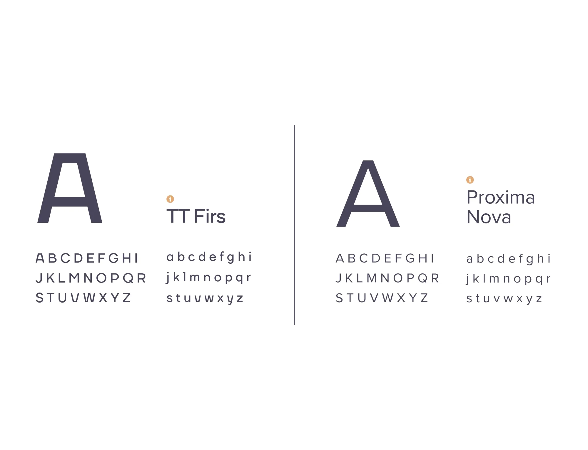
In co-creation, we refined Perel’s positioning. We defined a clear brand strategy: trendy and affordable, with practical solutions for everyday convenience. The logo design was updated and complemented with a new baseline.
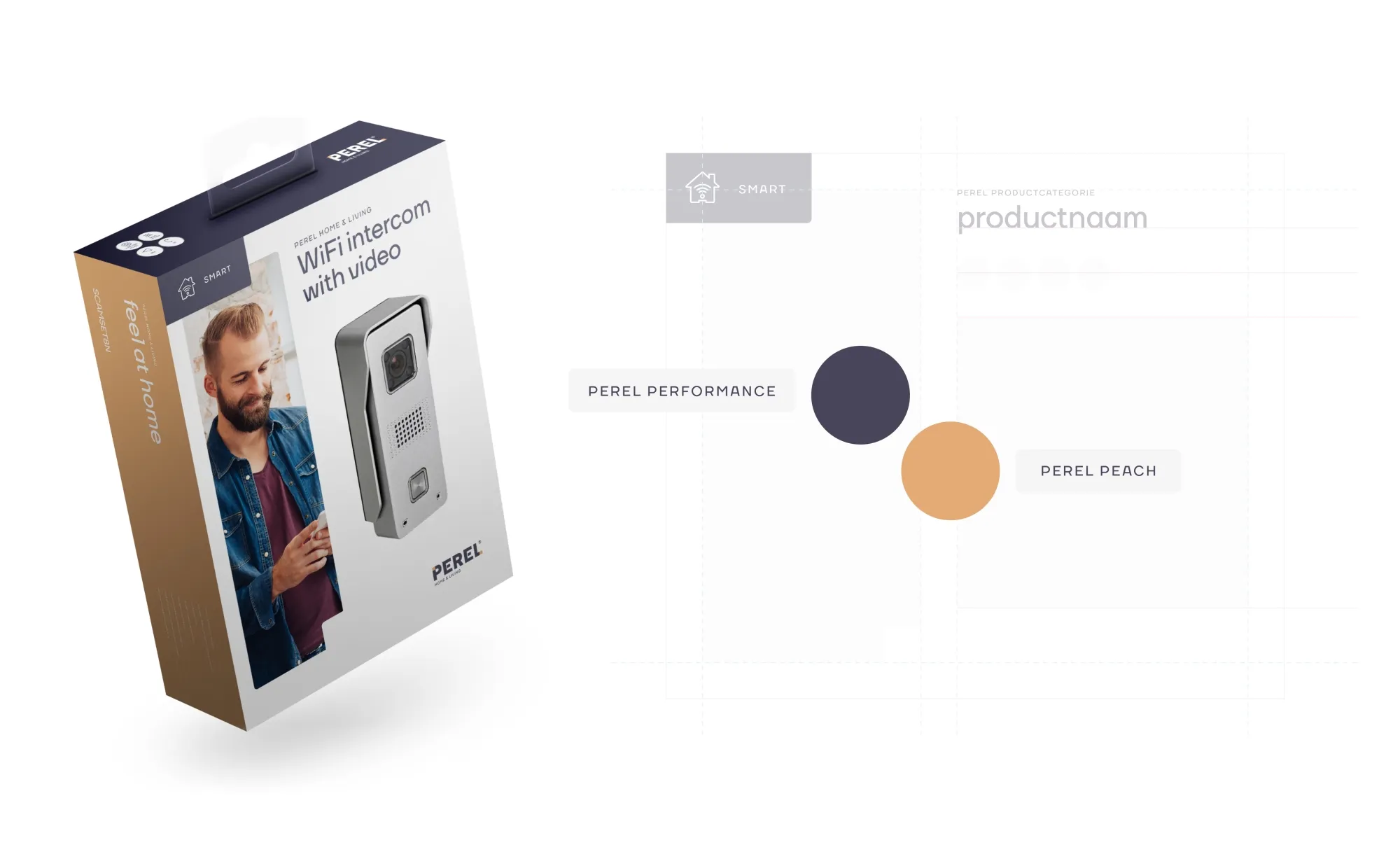
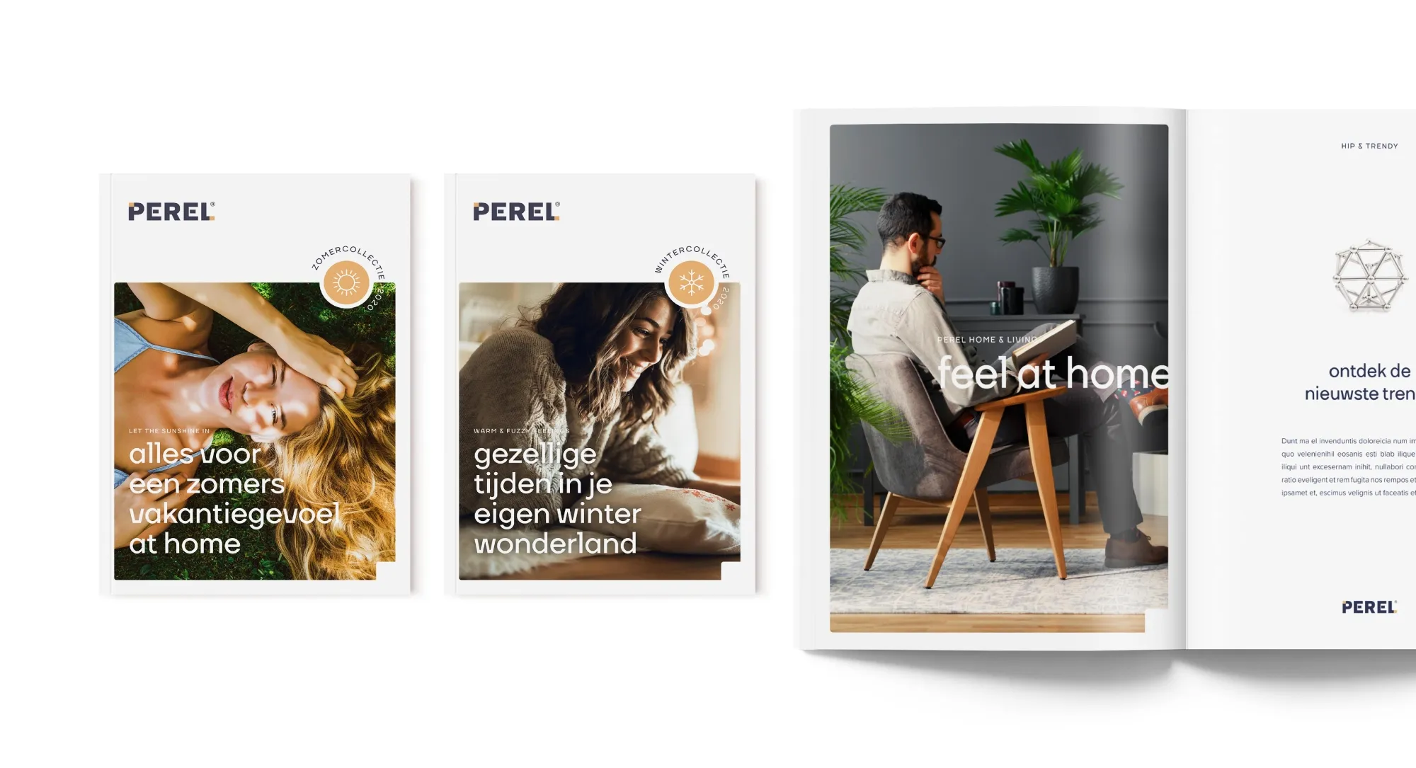
We developed a coherent visual line with strong imagery and packaging that made the brand stand out on the shelf. In addition, more attention was given to product structure, ensuring the range was presented in a more consistent and relevant way.


Results
Perel evolved from a basic brand into one with a clear positioning and strong visual impact. The renewed corporate identity and packaging increased shelf visibility and strengthened brand recognition. Retail partners gained a brand that stands out in a competitive market, while consumers now see Perel as both an affordable and reliable alternative.

Our takeaways
This case demonstrates how a clear brand foundation and consistent brand identity can give a brand new strength. By aligning strategy, design, and product structure, Perel became more relevant to both retailers and consumers. It confirms that even in a price-sensitive market, brand preference can be built with the right branding and recognizability.


