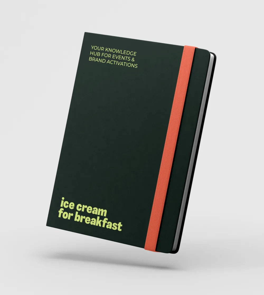
Ice Cream for Breakfast: a fresh brand identity that stands out and convinces
Ice Cream for Breakfast is an experienced marketing agency that works with companies, brands and teams. They share market knowledge, streamline processes, open their network and provide training and support. To improve their brand identity, they were looking for a distinctive visual style that would showcase their creative and entrepreneurial spirit. Comma co-created a visual style and corporate identity that perfectly reflects their creative energy and expertise in events and brand activations.

Challenge
Ice Cream for Breakfast is anything but a traditional player. Their approach is energetic, creative, and well thought out. The challenge?
- Translate their unique name and story into a consistent corporate identity.
- Develop a visual style that radiates creativity and energy, while also conveying trust and professionalism.
- Create an identity that is distinctive in the events and brand activations market and versatile enough to be used across communication channels, both online and offline.


Our approach
Analysis & direction
We went back to the essence: who is Ice Cream for Breakfast, and how do they want to be perceived? Their strength lies in innovation, co-creation, and collaboration. These values formed the foundation for the visual translation.
Concept development
From that positioning, we developed a concept that is fresh, playful, and surprising. It had to spark curiosity while remaining professional enough to convince partners.
Creative translation
The concept was shaped into a brand identity that is recognizable and versatile:
- a playful and distinctive logo design that symbolizes their energy,
- a bold color palette and typography that immediately set the tone,
- a consistent corporate identity combining creativity with professionalism,
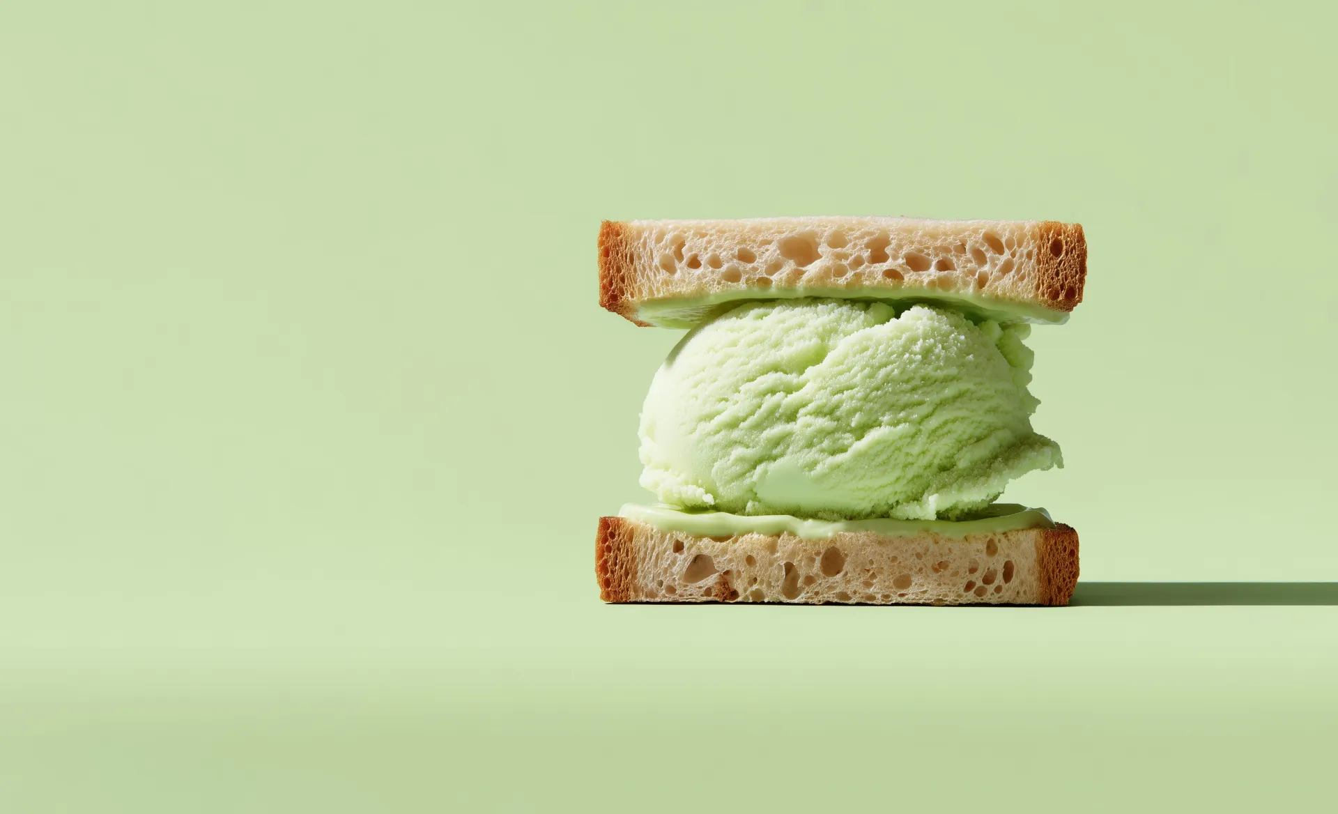
- a campaign image style with sharp contrasts, playful typography, and visuals that surprise.
This style was applied across online visuals, presentations, print, and digital applications. As a result, Ice Cream for Breakfast now has a coherent and recognizable appearance on every channel.
Well-defined choices
We deliberately chose boldness and surprise. The identity had to extend the daring nature of the name through color, form, and tone of voice. By working consistently with recognizable elements, we created a brand image that is both distinctive and reliable — a balance crucial in the competitive events and activations market.


Results
The new brand identity gave Ice Cream for Breakfast the look their approach deserves:
- A recognizable visual identity that reflects their energy and creativity.
- A corporate style and visual language that can be applied broadly, from social media advertising to training and events.
- A brand that makes a visual impact and engages more strongly with clients and partners.
Our takeaways
This case demonstrates that strong imagery is more than just graphic design. It is the translation of brand values into a style that resonates with people and distinguishes brands. For us, it confirms that design agency work only has real impact when it is grounded, co-created, and consistently carried through every form of communication.